Today I wanted to talk a little bit about why I chose to shoot in colour. I recently made the acquaintance of Josh White, a Canadian street photographer living in Seoul, South Korea. His black and white images are grainy, gritty and full of high contrast punch and he’s a photographer I’ve admired the work of for some time.
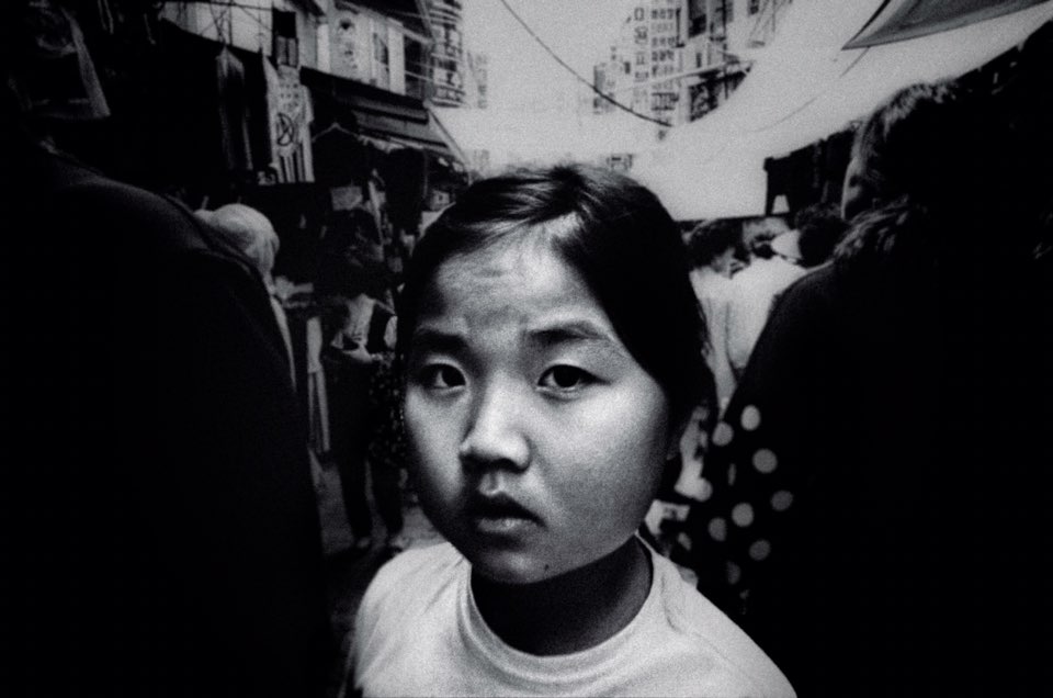
Seoul, South Korea. Josh White.
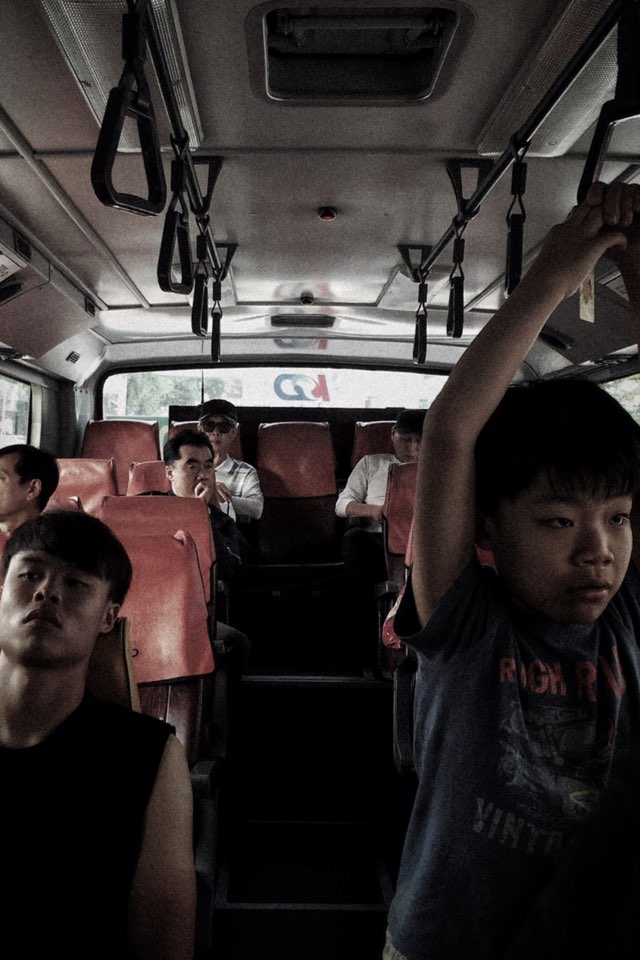
Suwon, South Korea. Josh White.
Up until recently I thought he exclusively shot in black and white, but then he posted a blog sharing some of his colour photography. This got me thinking about how we make the choice between colour and black and white, where our preferences sit and what it means to us personally.
Why choose?
When I started taking my documentary and street photography more seriously one of the first things I did was decide whether I wanted to shoot in black and white or colour. I wanted to pick one and stick with it so that my photographs had a consistent look. This was a tough choice to make because colour and black and white both have their merits.
The history of colour photography and why I chose colour
As I’m sure you are aware, black and white film was the only option back in the day. The old masters shot in B&W and it certainly never did them any harm. Some of the most critically acclaimed photographs and photographic projects were shot in black and white. See Henri Cartier-Bresson, one of the founding fathers of street photography and arguably one of the most well-known names in street photography – I recommend his iconic book The Decisive Moment. Also see Robert Frank’s The Americans and Josef Koudelka’s Exiles.
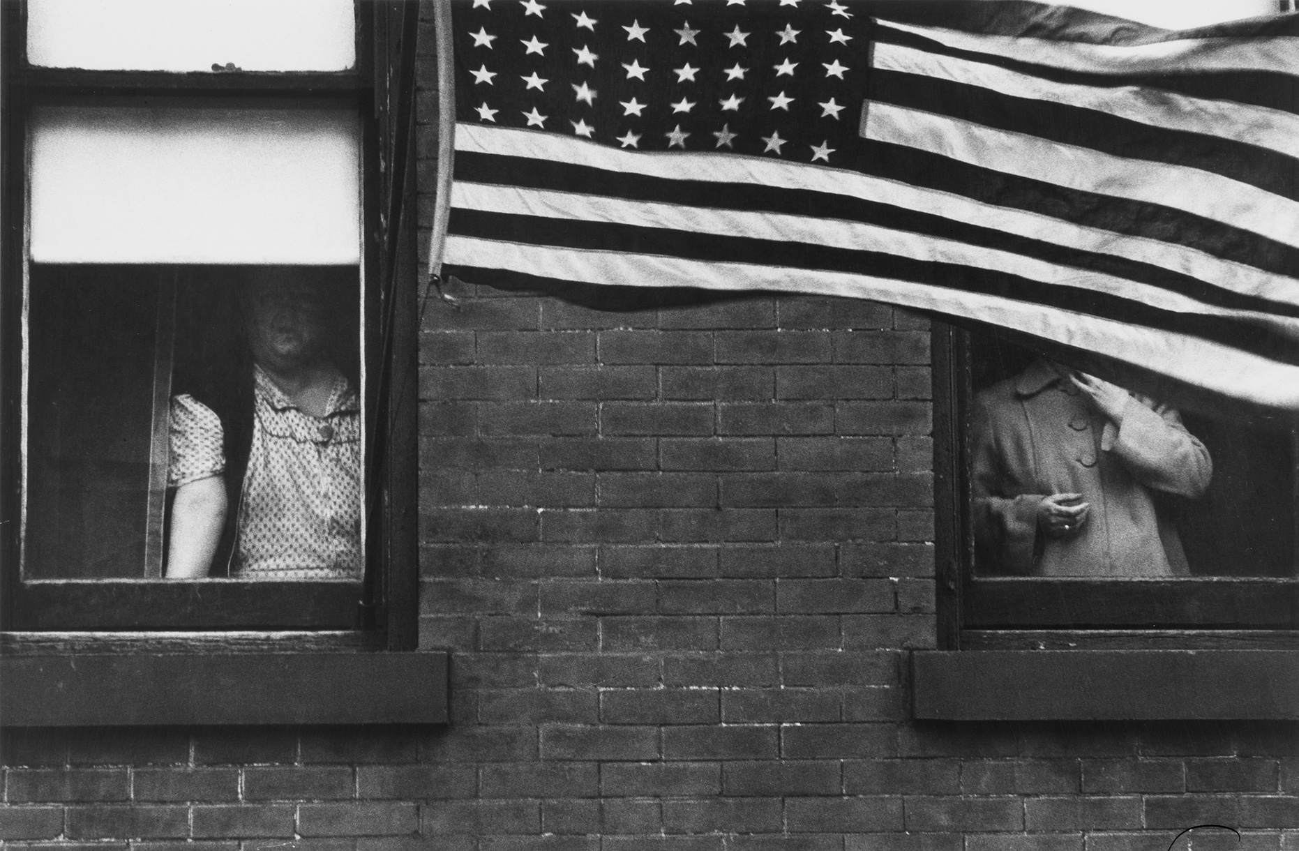
From ‘The Americans’ by Robert Frank
I think that the masters and pioneers of street photography, and in particular the members of the Magnum photo agency, are the reason why shooting street and documentary photography in black and white is still so popular even today; long after the introduction of colour film. Black and white invokes a sense of nostalgia, and has that classy, arty look to it. I find it’s very flattering and is great for portraits. It also removes any possible distractions caused by colour. Let’s say you’ve got a great shot of your subject doing something interesting but there’s a bright red sign right above their head drawing the viewers eye away from the desired focus of the image – that could be off-putting in colour. I do wonder though how many of the great masters of our art would’ve chosen colour if they’d had the choice.
When colour film was first introduced some of the masters of photography at the time, like Ansel Adams, thought it was vulgar and that you couldn’t make good art photography in colour because it was distracting from the subject. Though at that time, these guys had spent their whole photographic careers crafting the way they developed and printed their black and white photographs and they had it nailed (see Ansel’s Zone System). When colour film came along, they couldn’t develop it themselves; it was a new technology and they had to send it into a lab if they wanted to shoot colour. With black and white film, developing and printing was a huge part of the process and losing creative control probably felt like a step backwards so it’s easy to see why they wouldn’t welcome the change. Most people don’t like change and will try to maintain a status quo given half a chance. Equally there were plenty of other photographers who were keen to embrace the new medium. There’s an interesting wikipedia page about the history of colour photography that’s worth a read.
I’m a serious procrastinator; and I think a lot of us are. I had a gut feeling that I wanted to shoot in colour but while I was deciding I did a lot of research. What I found was that many people thought that black and white was an easier medium to work with because you don’t have to worry about colour detracting from your composition. There are also a lot of people that think that black and white is better for shooting when the light isn’t good. To be honest though, I personally disagree with both of these viewpoints. The main reason I photograph is for documentary purposes. Getting a good composition is a secondary bonus, and I find that shooting in black and white puts the focus heavily on the composition. Shooting in colour allows me to make an interesting image (to me at least) without it having a super strong composition. I’m not looking for any awards or recognition for my photographs, they only need to please me. And whilst I agree that colour photos look better when the light is good, i.e. golden hour, I find that with black and white the light is even more important. If you like high contrast black and white imagery as I do, it is easy to lose the subject to darkness when there is strong or varied lighting across the scene. With colour this is not so much of a problem. Of course you could shoot in black and white with a flash, but I prefer the lightness of touch that comes with avoiding flash and only really use it if I have to.
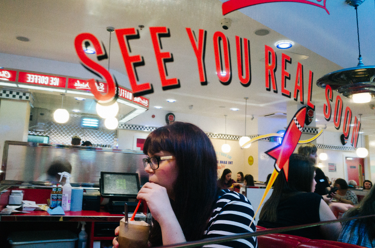
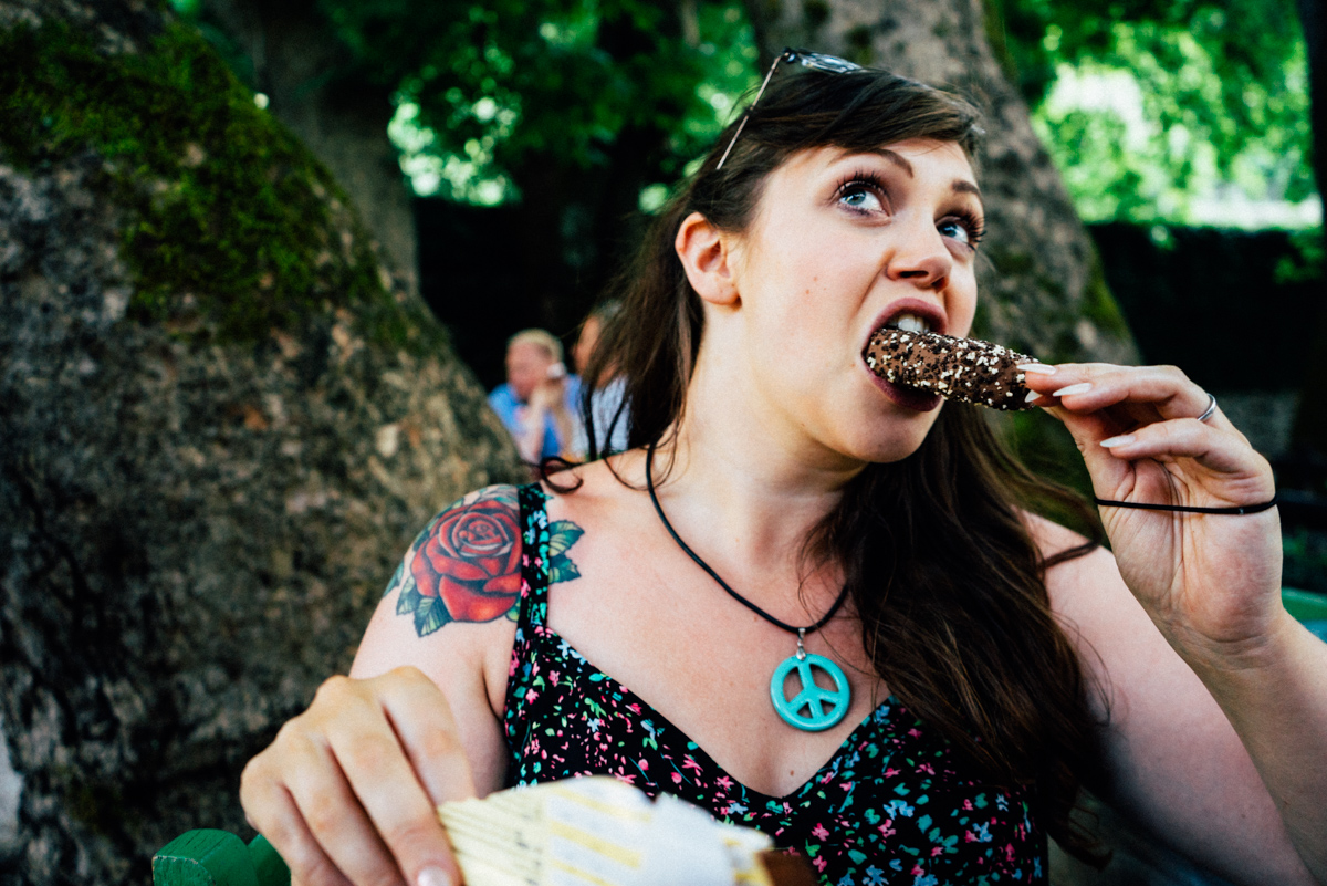
After much procrastination and experimentation, I decided that I could do all the research in the world but the best bet was to just go with my gut feeling. Colour was where my heart was leading me, and I think this is the most important thing when making the decision. For me, I want to document what I see in an accurate way. Don’t get me wrong, I use film emulation presets to post-process my photographs, so I alter the colour of my images somewhat, but I still get to keep the colours as a cue to remember what it was I saw that day and colour can be a big part of what drew me to that particular subject. At the end of the day we are simple animals, and we see in colour for a reason; we evolved this way because colour has meaning to us. I’m an engineer and I like data. Colour is data. It is a source of information. It also forms a large part of fashion, advertising, and branding. These are things that appear often in street and documentary photographs. In fifty years time when I look back at my photos the colours will help to place them at a point in time, and that really appeals to me. This information is lost when you shoot in black and white. I want my photographs to be more date specific than that.
Faye, Crete, 2015. Matthew Martin.
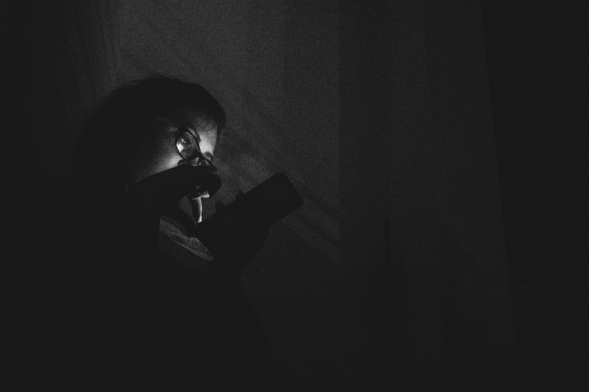
On the other hand, like Josh, I don’t shoot 100% solely in colour, I just have a very strong preference towards it. Occasionally I do post process a shot in black and white, but I only really do it when it is a photo I don’t want to include in my photography projects, when I’m not worried about breaking my rules of consistency or there is little colour information to add to the image; for some reason I find I just prefer the image in black and white. I don’t take many photos on my phone, but when I do I process the low light shots in black and white purely because there is so much colour noise they look plain ugly unless I convert them.
Faye, Crete, 2015. Matthew Martin.
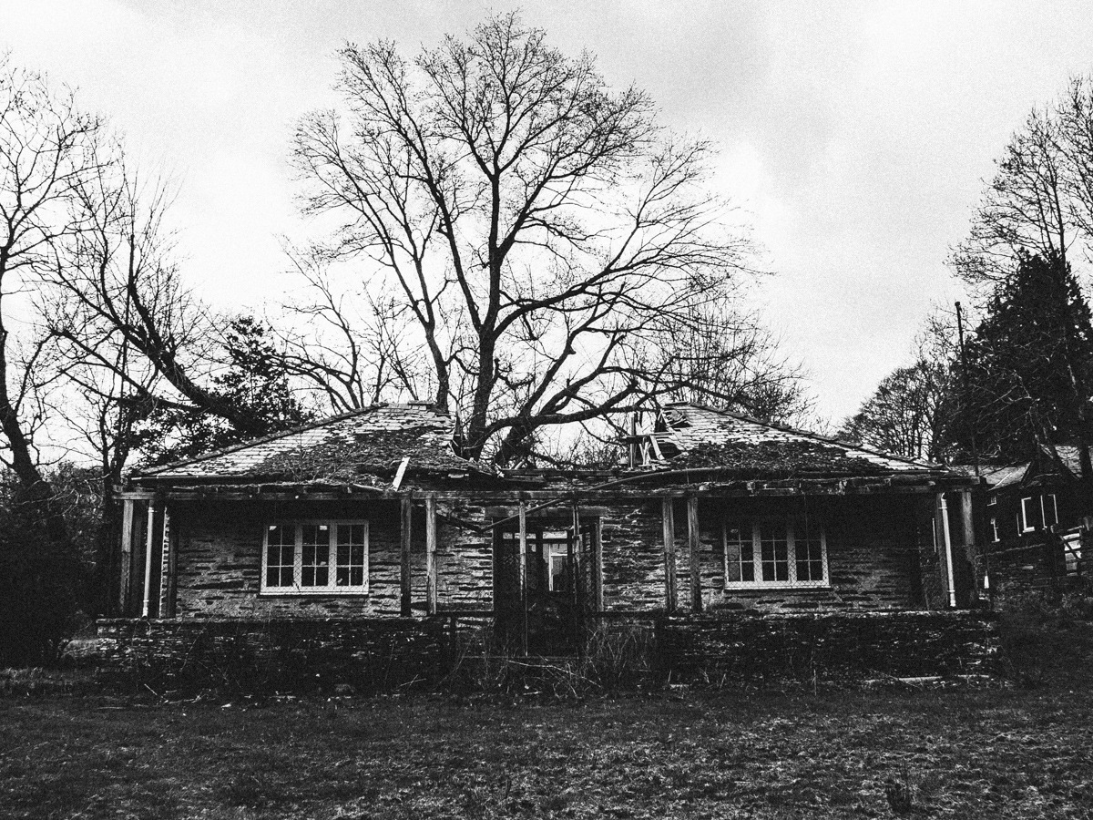
Abandoned Clubhouse, Snowdonia, 2015. Matthew Martin.
A quick overview of my Lightroom catalog tells me that in 2015 I processed 2815 images, and only 305 of them in black and white. That puts me at about 10% B&W images, which kind of surprises me, I thought it would be less than that. I do know for a fact that I haven’t printed any B&W shots in the past 12 months.
How to choose subjectively
If you shoot digital and use RAW files this makes things easier. Take a bunch of photos in Lightroom, add them to a collection and post-process them in colour until you find something you like. I recommend using VSCO presets for this to speed things up. Select all of the images, right click and select “Create Virtual Copies”; this will duplicate the images (it doesn’t actually create another copy of the original file, it just lets you make a second set of edits to the RAW file). Convert the virtual copies you made to black and white and see which ones you prefer. Simple! Of course it’s not that simple, some images work best in black and white and others work best in colour, and you will likely need to play with the exposure, highlight and shadow sliders again to get things looking right. You could even get some 6×4’s printed and stick them on your wall for a couple of weeks. Giving them a bit of extended viewing time might help you make a choice. This is not a foolproof method but it should give you an idea of what your aesthetic preferences are.
If you shoot film you’ll just have to shoot some colour and black and white film and see which you prefer. Of course, different B&W and colour films have different properties that you may or may not like so you may need to try several of each to find the ones you prefer. Google is your friend if you want to look down this avenue. There is still a big community of photographers using film who are more than happy to share advice. I can recommend www.talkphotography.co.uk if you’re looking for a friendly forum.
Ultimately, the choice is yours
Please don’t take my preference for colour photography as me slagging off black and white photography. When it comes to the work of other photographers, I really do love both. I often think that black and white images can be more emotive than colour images. This makes it an even harder decision for me to shoot in colour. Black and white is just not for me. I’ll never say I wouldn’t make the switch to B&W, but for a reason I don’t fully understand myself, my personality is predisposed towards the additional context that colour adds to my photographs.
In all honesty, my recommendation is to go with your gut feeling and shoot in the medium that you are drawn to the most and the one you are most comfortable with. I think this way you’ll produce better photos and photos you are happier with. And that is all that matters really.